Hampton Enterprises
Hampton Branding
A rebrand for Hampton Enterprises and Properties & Construction.

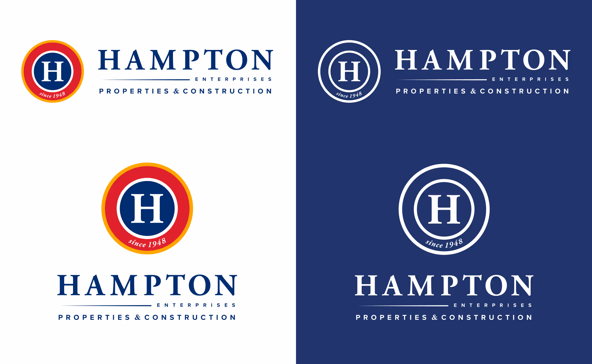
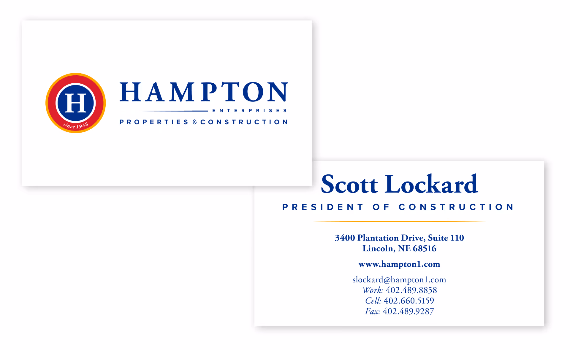
Hampton Enterprises has a proud history with 70 years in business. The good news is that Hampton has grown substantially over those 70 years, expanding into two divisions: construction and properties. The bad news: with that growth came an inconsistent brand involving three different logos.
Our challenge was to bring consistency to the Hampton Enterprises brand. We cleaned up their logo in a way that ties together their two divisions and can work well in a variety of applications, from digital to truck wraps to construction banners. The redesign brings the Hampton brand into modern times while still paying homage to their rich history.
In terms of the website redesign, we’re especially proud of the forethought that went into this project. Can we say we’re proud? We think so.
When you drop into their landing page, Hampton Enterprises’ bi-fold approach to the business is immediately apparent, not only visually so, but interactively, too. We wanted the conceptual aspect of how they operate – which, to the layperson looking to work with them, might not click right away – to live inside the design.
Split right down the middle, properties to the left and construction to the right, the homepage is total testament to the uniqueness of their company’s operations. Building function into form isn’t just set dressing. It’s intentional design that creates a fluid user experience and fosters the kind of ease-of-use and flow our design team’s always striving to achieve.
Challenges:
Lorem ipsum dolor sit amet, consectetur adipiscing elit. Suspendisse varius enim in eros elementum tristique. Duis cursus, mi quis viverra ornare, eros dolor interdum nulla, ut commodo diam libero vitae erat. Aenean faucibus nibh et justo cursus id rutrum lorem imperdiet. Nunc ut sem vitae risus tristique posuere.
Solutions:
Lorem ipsum dolor sit amet, consectetur adipiscing elit. Suspendisse varius enim in eros elementum tristique. Duis cursus, mi quis viverra ornare, eros dolor interdum nulla, ut commodo diam libero vitae erat. Aenean faucibus nibh et justo cursus id rutrum lorem imperdiet. Nunc ut sem vitae risus tristique posuere.

.avif)
Hampton Enterprises has a proud history with 70 years in business. The good news is that Hampton has grown substantially over those 70 years, expanding into two divisions: construction and properties. The bad news: with that growth came an inconsistent brand involving three different logos.
Our challenge was to bring consistency to the Hampton Enterprises brand. We cleaned up their logo in a way that ties together their two divisions and can work well in a variety of applications, from digital to truck wraps to construction banners. The redesign brings the Hampton brand into modern times while still paying homage to their rich history.
In terms of the website redesign, we’re especially proud of the forethought that went into this project. Can we say we’re proud? We think so.
When you drop into their landing page, Hampton Enterprises’ bi-fold approach to the business is immediately apparent, not only visually so, but interactively, too. We wanted the conceptual aspect of how they operate – which, to the layperson looking to work with them, might not click right away – to live inside the design.
Split right down the middle, properties to the left and construction to the right, the homepage is total testament to the uniqueness of their company’s operations. Building function into form isn’t just set dressing. It’s intentional design that creates a fluid user experience and fosters the kind of ease-of-use and flow our design team’s always striving to achieve.

